Why Customers Can’t Complete Purchases in Your App

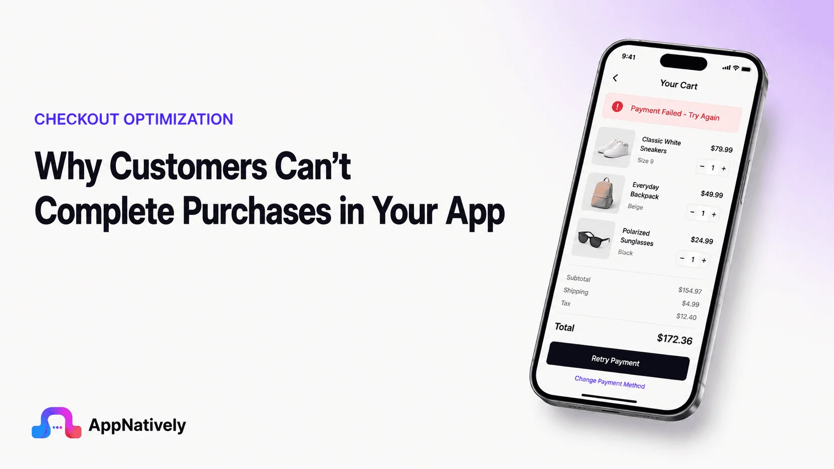
Getting customers into your app is only half the job. The harder part is helping them complete what they came to do.
A customer can discover a product, read the details, add it to a cart, select a delivery option and still leave without paying. When customers can’t complete purchases in your app, the problem may not be a lack of demand.
It may be a broken payment flow, confusing checkout, unexpected costs, poor performance, missing payment options or a small usability issue that becomes a major obstacle on a phone.
The most important thing is to stop treating every abandoned purchase as the same problem. Some customers leave because they change their minds. Others leave because your app gives them no practical way to finish.
In this guide, we’ll explain how to tell the difference and how to systematically find and fix the problems that prevent completed purchases.
Why Customers Can’t Complete Purchases in Your App
A completed purchase requires several systems to work together.
The customer needs to understand the offer, trust the business, accept the price, navigate the checkout, provide the required information, choose an available payment method, successfully authorize the payment and receive confirmation.
A failure at any one of those points can stop the transaction.
That means your purchase conversion rate is not controlled by the payment screen alone. It is the result of the entire customer journey.
Purchase intent and purchase completion are different
One of the biggest mistakes teams make is assuming that every abandoned cart represents a lost sale that could have been recovered.
That is not true.
Some customers add products while comparing prices. Others are browsing, saving products for later or simply aren’t ready to buy. Baymard’s latest research found that more than 42% of U.S. online shoppers had abandoned a cart because they were just browsing or weren’t ready to buy.
You cannot eliminate that behavior through better checkout design.
Instead, focus on avoidable friction.
If a customer wants to buy but cannot because your app crashes, rejects a valid payment method, hides the final price or forces them through an unnecessarily complicated checkout, you have a problem worth fixing.
A purchase can fail before checkout even begins
It is tempting to define checkout as the moment a customer taps “Buy.”
In reality, purchase friction often begins much earlier.
A customer may decide not to continue because:
- The product information is incomplete
- The price is unclear
- Shipping information is difficult to find
- Delivery takes too long
- Returns are unclear
- Reviews don’t answer important questions
- The product appears unavailable
- The app feels untrustworthy
- The purchase requires too much commitment
By the time the customer reaches checkout, they have already made dozens of small decisions.
Your conversion problem may therefore be a pre-checkout problem disguised as a checkout problem.
The Purchase Journey Has More Failure Points Than You Think
A useful way to investigate failed purchases is to map the entire journey.
A typical app purchase might look like this:
Product discovery → Product evaluation → Add to cart → Cart review → Checkout start → Customer information → Delivery → Payment → Authorization → Order creation → Confirmation
Every arrow represents a possible point of failure.
For example, a customer may:
- View the product but never add it to the cart
- Add the product but abandon the cart
- Start checkout but leave after seeing shipping costs
- Enter an address but encounter validation problems
- Select payment but receive an unsupported-method message
- Submit payment but experience a timeout
- Complete payment but never receive confirmation
These are different problems.
Treating them all as “cart abandonment” hides the information you need to fix them.
How To Tell Whether Your Problem Is UX, Payment or Technology
Before changing your checkout, classify the failure.
This simple distinction can save weeks of unnecessary redesign work.
UX failures
UX failures happen when customers can complete the purchase technically but struggle to understand or use the interface.
Examples include:
- Confusing button labels
- Too many form fields
- Poor navigation
- Hidden guest checkout
- Unclear pricing
- Difficult address entry
- Weak error messages
- Poor mobile layouts
- Confusing checkout steps
These problems usually require changes to the interface, flow or content.
Payment failures
Payment failures happen when customers attempt to pay but the transaction is rejected, interrupted or cannot be authorized.
Examples include:
- Card declines
- Authentication failures
- Unsupported payment methods
- Expired cards
- Insufficient funds
- Fraud or risk checks
- Payment processor errors
- Wallet failures
These problems require payment-level investigation rather than simply redesigning the checkout.
Technical failures
Technical failures occur when the underlying application or services prevent the transaction from completing.
Examples include:
- API errors
- Timeouts
- App crashes
- Session expiration
- Inventory synchronization failures
- Network interruptions
- Order creation failures
- Duplicate transaction protection
- Payment confirmation delays
A beautiful checkout cannot compensate for a checkout API that fails 3% of the time.
Business-policy failures
Some customers leave because your policies make the purchase unattractive.
Examples include:
- High shipping costs
- Slow delivery
- Unfavorable return policies
- Minimum order requirements
- Limited payment options
- Unexpected taxes or fees
These aren’t necessarily UX problems.
You can improve how you communicate them, but you cannot design your way out of an offer customers don’t consider worthwhile.
The Most Common Reasons Customers Abandon App Purchases
The following problems deserve particular attention because they can affect customers who are otherwise ready to buy.
Unexpected costs appear too late
Price transparency is one of the strongest factors affecting purchase completion.
A customer may be comfortable paying $40 for a product. They may not be comfortable discovering a $12 delivery fee after spending several minutes entering information.
Baymard’s latest checkout research identifies unexpected extra costs, including shipping, taxes and fees, as the leading reason shoppers abandon checkout.
The lesson is straightforward:
Don’t make customers calculate the real price for themselves.
Show the cost as early as practical.
If shipping depends on location, provide an estimate before the customer reaches the final payment step.
If taxes or fees cannot be calculated immediately, explain why and show when they will be calculated.
The customer is forced to create an account
Account creation benefits businesses.
It can improve retention, make repeat purchases faster and provide access to order history and personalized experiences.
But the customer doesn’t necessarily care about those benefits when they are trying to buy something.
Baymard’s research found that 19% of shoppers reported abandoning because a site wanted them to create an account. It also recommends delaying account creation until after the purchase rather than interrupting checkout with it.
A better approach is:
Let the customer buy first. Ask for the account later.
After the order is confirmed, you can offer to save their information and create an account using the details they already provided.
The checkout feels longer than it needs to be
Customers don’t count fields the way your product team does.
They experience each field as another task.
Name. Email. Phone. Address. Apartment. City. State. ZIP code. Password. Date of birth. Marketing preference. Account preference.
Individually, each field may look harmless.
Together, they can make a mobile checkout feel exhausting.
Baymard’s current research found that 17% of US shoppers abandoned because checkout was too long or complicated. Its benchmark also found a substantial gap between the number of form elements an optimized checkout can use and what many sites actually display.
The right question isn’t:
“Can we collect this information?”
Ask:
“Do we need this information right now to complete the purchase?”
If the answer is no, remove it or postpone it.
Customers have to type information your app already knows
Mobile typing is expensive in terms of effort.
If the customer already has an address saved in the app, don’t make them type it again.
If their email is associated with their account, prefill it.
If a payment method is already saved securely, make it easy to use.
If the device can provide information through autofill or other native capabilities, use them where appropriate.
Stripe’s current mobile checkout guidance similarly emphasizes reducing typing, making forms comfortable to use on small screens, supporting mobile-native payment methods and designing for speed.
Address entry becomes a bottleneck
Address forms are deceptively difficult.
Different countries use different formats. Some addresses have apartment numbers. Some don’t. Postal codes vary. Some locations don’t use them at all.
A rigid form can reject valid addresses or force customers through fields that don’t make sense in their region.
Use location-aware address fields where appropriate and support autofill or address lookup when it improves accuracy.
Baymard’s checkout research specifically identifies address entry as a high-friction area and recommends features such as automatic address lookup and compatibility with autofill.
Payment methods don’t match customer expectations
Customers have preferences.
One customer may want to use a card. Another may prefer a digital wallet. Someone else may expect a local payment method.
If the payment screen only supports one method, customers who cannot or do not want to use it may have no path forward.
Baymard reports that 9% of shoppers in its research abandoned because there weren’t enough payment methods.
This doesn’t mean you should add every payment method available.
Instead, analyze your customer base and identify the methods that matter most by:
- Country
- Device
- Customer segment
- Order value
- Purchase frequency
- Existing payment behavior
Then prioritize those methods.
Payment Failure Is Not the Same as Checkout Abandonment
This distinction is critical.
Imagine 1,000 customers reach the payment screen.
Suppose:
- 700 submit payment
- 600 payments succeed
- 100 payments fail
- 200 customers leave before submitting payment
You have at least two separate problems.
The first is payment completion.
The second is checkout abandonment before payment submission.
If you combine the two into one metric, you may spend time optimizing the wrong thing.
Build a payment failure taxonomy
Don’t track every failed payment under one event called:
payment_failed
Instead, categorize the reason.
Your categories might include:
- Card declined
- Insufficient funds
- Expired payment method
- Invalid payment information
- Authentication failure
- Risk rejection
- Processor error
- Network timeout
- Customer canceled
- Duplicate transaction
- Unknown error
The categories will depend on your payment infrastructure, but the principle is universal:
You cannot fix a failure you cannot distinguish.
Make error messages actionable
An error message should answer three questions:
What happened?
Why did it happen?
What should I do now?
Compare:
Payment failed.
with:
Your bank declined this payment. Check your card details or try another payment method.
The second message gives the customer a path forward.
Stripe’s current checkout guidance recommends identifying validation errors quickly, explaining what is wrong and placing useful messages close to the affected field instead of relying on generic messages.
Never make customers start over after a recoverable failure
This is one of the most expensive checkout mistakes.
A customer enters their information.
They select shipping.
They enter payment details.
The payment fails.
Your app sends them back to the beginning.
Now they have to repeat everything.
A customer who was willing to buy has just been given a reason to stop.
For recoverable failures, preserve as much state as safely possible.
The customer should be able to:
Try again → Change payment method → Correct the problem → Complete the order
without rebuilding the entire checkout.
The App May Be Telling Customers the Payment Failed When It Actually Succeeded
This is a particularly dangerous class of problem.
Consider this sequence:
- Customer taps Pay.
- Payment processor receives the request.
- The bank authorizes the transaction.
- Your app waits for the response.
- The network connection times out.
- Your app displays “Payment failed.”
The customer may have actually been charged.
If they try again, you could create a duplicate payment or create confusion about whether the order exists.
This is not merely a UX issue. It is a transaction-state problem.
Your system needs to distinguish among states such as:
- Payment initiated
- Payment processing
- Payment authorized
- Payment failed
- Payment canceled
- Payment confirmation pending
- Order created
- Order confirmation pending
The interface should reflect the actual state as accurately as possible.
Give customers a clear processing state
If payment takes longer than usual, don’t leave customers staring at a frozen button.
Tell them what is happening.
For example:
Processing your payment…
Then handle the outcome appropriately.
If confirmation is delayed, don’t immediately declare failure.
A short delay with accurate feedback is far better than a false failure message.
Mobile UX Creates Its Own Purchase Problems
An app isn’t simply a smaller version of a desktop checkout.
Mobile customers use touch instead of a mouse. They may be walking, multitasking or using a weak cellular connection.
The screen is smaller, typing takes more effort and interruptions are more likely.
Stripe’s current mobile checkout guidance highlights these differences and recommends focused layouts, easy-to-tap controls, reduced typing, clear communication, speed and graceful error handling.
Small buttons create large problems
A button can look perfectly acceptable on a design mockup and still be difficult to use on a real phone.
Primary actions need enough space to tap confidently.
This is especially important for:
- Continue buttons
- Payment buttons
- Address selectors
- Payment method options
- Quantity controls
- Edit buttons
- Confirmation actions
A customer should not have to zoom, carefully aim or tap multiple times.
The keyboard covers the form
Mobile keyboards can hide the next field or the primary action.
If customers cannot see what they are typing, they are more likely to make mistakes.
Test every form with the keyboard open.
Check:
- Does the screen scroll automatically?
- Can the active field remain visible?
- Does the keyboard type match the input?
- Can customers dismiss the keyboard easily?
- Is the next action still accessible?
These details are easy to overlook and easy for customers to hate.
The checkout breaks when customers leave the app
Mobile customers may switch apps during checkout.
They may check a message, open a bank authentication screen, copy an address or respond to a notification.
When they return, the checkout should recover gracefully.
Test:
- Backgrounding the app
- Locking the phone
- Switching applications
- Losing network connectivity
- Reopening the checkout
- Session expiration
- Payment authentication redirects
A checkout flow that only works when the customer stays inside the app continuously is fragile.
Trust Can Stop a Purchase Even When Everything Works
Sometimes the customer can complete the transaction but chooses not to.
That’s a different problem.
Customers are giving you money and, in many cases, sensitive personal and payment information.
They need to feel confident about what will happen next.
Show the complete purchase summary
Before payment, customers should be able to verify:
- What they are buying
- Quantity
- Price
- Discount
- Shipping
- Taxes
- Fees
- Total
- Delivery timing
- Payment method
Don’t make customers hunt through previous screens.
The final review should answer:
“Exactly what am I agreeing to pay for?”
Explain recurring purchases clearly
Subscriptions require additional clarity.
Customers should understand:
- Initial price
- Recurring price
- Billing frequency
- Trial period
- Renewal behavior
- Cancellation terms
A customer who feels tricked into a subscription may complete the transaction once and never return.
Clear communication protects both conversion and long-term trust.
Make shipping and return policies easy to find
Customers often need confidence about what happens after purchase.
If delivery timing, shipping costs or return conditions are difficult to find, customers may postpone the purchase.
Baymard’s research has repeatedly found strong customer interest in shipping and return information, including the need for this information to be accessible before and during checkout.
The solution isn’t to fill checkout with policy text.
Make the important information available at the moment customers need it.
Performance Problems Can Look Like UX Problems
A customer may describe your checkout as “confusing” when the real problem is that the interface takes 10 seconds to respond.
Slow experiences create uncertainty.
The customer taps a button.
Nothing happens.
They tap again.
Still nothing.
Now they don’t know whether the first action worked.
This can produce duplicate submissions, accidental cancellations and abandonment.
Measure the time between customer actions and feedback
Track the performance of important checkout interactions.
Measure:
- Checkout load time
- Address lookup response time
- Shipping calculation time
- Payment method loading
- Payment submission response
- Order creation
- Confirmation screen loading
Don’t just monitor average performance.
Look at slower percentiles and real customer environments.
An average response time can look healthy while a meaningful percentage of customers experience serious delays.
Design for weak networks
Customers won’t always have fast Wi-Fi.
Your checkout should behave predictably when:
- Network speed drops
- Connections disappear temporarily
- Requests time out
- Responses arrive late
- The customer changes networks
A good offline or poor-network strategy doesn’t mean allowing every purchase to happen offline.
It means handling uncertainty clearly.
Inventory and Pricing Can Break the Purchase at the Last Moment
Customers can become frustrated when the product they selected changes after they start checkout.
For example:
“This item is no longer available.”
or:
“The price has changed.”
These situations may be unavoidable, but the way you handle them matters.
Don’t silently change the customer’s order
If quantity, price or availability changes, tell the customer.
Explain:
- What changed
- Why it changed, when appropriate
- What the customer can do next
Never make the customer discover an unexpected change after payment if you can prevent it.
Validate inventory at the right time
Inventory systems need to balance accuracy with user experience.
If stock is limited, determine when inventory should be revalidated.
If an item becomes unavailable, provide a recovery path rather than simply returning an error.
For example:
Only two units remain. Your requested quantity is no longer available. Update your quantity to continue.
That’s much better than:
Something went wrong.
App Updates Can Quietly Break Checkout
One of the most overlooked causes of purchase failures is a new app release.
A checkout that worked yesterday may break today because of:
- API changes
- SDK updates
- Payment library changes
- Operating system changes
- Authentication changes
- Deep-link behavior
- Webview changes
- Backend compatibility problems
This is why checkout should be monitored by app version.
If conversion suddenly drops after a release, compare the affected version with the previous version.
A sudden drop is often more useful than a general long-term conversion trend.
Build A Purchase Funnel That Shows Where Customers Get Stuck
If you want to solve this problem systematically, instrument the entire purchase journey.
A basic event model might look like this:
| Stage | Event |
|---|---|
| Product | Product viewed |
| Cart | Item added |
| Cart | Cart viewed |
| Checkout | Checkout started |
| Customer | Customer information submitted |
| Delivery | Delivery method selected |
| Payment | Payment method selected |
| Payment | Payment submitted |
| Payment | Payment succeeded |
| Payment | Payment failed |
| Order | Order created |
| Confirmation | Purchase confirmed |
You can then calculate conversion between each stage.
Find the largest drop, not just the lowest conversion
Suppose your data shows:
- 100,000 product views
- 20,000 add-to-cart events
- 12,000 checkout starts
- 10,000 payment attempts
- 9,700 successful payments
The biggest opportunity isn’t necessarily payment.
You might have a much larger problem between product discovery and add-to-cart.
Now imagine a different app:
- 100,000 product views
- 25,000 add-to-cart events
- 20,000 checkout starts
- 18,000 payment attempts
- 13,000 successful payments
Here, payment completion deserves immediate investigation.
This is why funnel analysis is more useful than staring at the overall purchase conversion rate.
Segment Your Purchase Failures
Overall numbers can hide serious problems.
Break purchase performance down by:
Device
Compare different phone models, screen sizes and operating systems.
App version
Look for changes after releases.
Payment method
One payment method may have a significantly higher failure rate.
Country or region
A checkout may work well in one market but fail because of payment, address or localization problems elsewhere.
New versus returning customers
Returning customers may have saved information, while new customers experience more form friction.
Order value
High-value transactions may encounter different risk controls or payment behavior.
Product category
Some products may have different inventory, shipping or pricing rules.
Network condition
If your data allows it, compare performance across connection types and network quality.
Segmentation turns a vague problem into a specific one.
Use A Failure Matrix Instead of One Abandonment Number
A useful internal tool is a simple failure matrix.
| Failure | Likely area | What to investigate |
|---|---|---|
| Checkout starts but payment isn’t selected | UX | Payment visibility and checkout flow |
| Payment selected but not submitted | UX or trust | Pricing, form friction, payment choice |
| Payment submitted but declined | Payment | Decline reason and recovery |
| Payment succeeds but order isn’t created | Technical | Order API and transaction handling |
| Order created but confirmation fails | Technical | Confirmation state and notifications |
| Customer sees unexpected total | Pricing/UX | Fees, tax and shipping disclosure |
| Customer can’t enter address | UX/Localization | Address fields and validation |
| Checkout crashes | Technical | Crash logs and app version |
| Customer retries after timeout | Technical/UX | Idempotency and transaction state |
| Customer leaves after account prompt | UX | Guest checkout and account timing |
This makes cross-functional troubleshooting much easier.
Don’t Optimize Checkout By Guessing
A common workflow looks like this:
Conversion drops → team redesigns checkout → conversion changes → nobody knows why.
That’s not optimization.
Before making a significant change, establish a baseline.
Then identify a specific hypothesis.
For example:
Customers on smaller screens are abandoning because the payment button is difficult to reach after the keyboard opens.
Now you can test a specific change.
Another hypothesis:
Customers are abandoning after shipping is calculated because the final cost is significantly higher than the product price suggested earlier.
Again, you can investigate a specific problem.
Use qualitative research to explain the numbers
Analytics tell you where customers stop.
Usability testing can tell you why.
Watch real users complete a purchase without helping them.
Look for moments when they:
- Stop and reread something
- Tap the wrong control
- Scroll repeatedly
- Search for information
- Ask what a term means
- Try to go backward
- Assume something is broken
- Become concerned about the price
- Look for another payment method
You don’t need hundreds of sessions to uncover obvious usability problems.
A handful of well-designed sessions can reveal issues worth investigating quantitatively.
A Better Way To Fix Checkout Problems
Don’t try to fix everything at once.
Prioritize problems using three factors:
Frequency × severity × business impact
A minor issue affecting 1% of customers may be less important than a payment failure affecting 8%.
At the same time, a problem affecting fewer customers can deserve immediate attention if it causes duplicate charges or incorrect orders.
Fix blockers before annoyances
Prioritize:
- Crashes
- Payment failures
- Incorrect totals
- Order creation failures
- Broken checkout buttons
- Lost checkout sessions
- Missing payment methods
Then address:
- Excessive fields
- Confusing labels
- Poor navigation
- Weak visual hierarchy
- Minor interaction friction
A checkout that occasionally fails should not receive a cosmetic redesign before the underlying failure is fixed.
A Step-By-Step Purchase Recovery Framework
If you’re responsible for improving an app’s purchase completion rate, use this process.
Step 1: Define the successful purchase
Document exactly what counts as a completed transaction.
Is it:
Payment authorized?
Order created?
Confirmation delivered?
These aren’t always the same event.
Your analytics and backend systems should agree on the definition.
Step 2: Map every purchase state
Document what happens from checkout start to confirmation.
Include successful, failed, canceled, delayed and unknown states.
This exposes gaps where customers may become stuck.
Step 3: Instrument the funnel
Track every meaningful step.
Don’t rely only on page views or one checkout event.
Capture the transition between states.
Step 4: Categorize failures
Separate:
- UX
- Payment
- Technical
- Business
- Trust
Don’t send every problem to the same team.
Step 5: Segment the data
Look at app version, device, region, payment method and customer type.
Find patterns.
Step 6: Reproduce the problem
Use the same device, app version, payment method and conditions where possible.
If customers report a failure that your team cannot reproduce, your monitoring needs improvement.
Step 7: Fix the highest-impact blocker
Start with the problem most directly preventing transactions.
Step 8: Test the fix
Run controlled testing where practical.
Monitor both conversion and failure rates.
Step 9: Watch for secondary effects
A change that improves one step can hurt another.
For example, reducing fraud friction may improve conversion but increase transaction risk.
Measure the complete outcome.
Step 10: Keep monitoring after release
Checkout optimization isn’t a one-time project.
New app versions, payment providers, operating systems, markets and business rules can introduce new failure points.
App Purchase Troubleshooting Checklist
Use the following checklist when customers report that they cannot complete purchases.
Product and cart
- Is the product available?
- Is the displayed price accurate?
- Are quantity changes working?
- Are promotions applied correctly?
- Are shipping costs visible early?
- Can customers save their cart?
Checkout
- Can customers check out without creating an account?
- Are unnecessary fields removed?
- Does autofill work?
- Are address fields appropriate for the customer’s region?
- Are errors shown beside the relevant fields?
- Can customers move backward without losing information?
Payment
- Are the expected payment methods available?
- What percentage of payment attempts fail?
- Which decline reasons are most common?
- Are authentication flows working?
- Can customers retry?
- Can they switch payment methods?
- Are duplicate submissions prevented?
Technical
- Are checkout APIs healthy?
- Are there recent crash spikes?
- Are timeouts increasing?
- Are failures concentrated in one app version?
- Does the checkout survive app backgrounding?
- Does it recover from network interruptions?
- Can the order state be recovered after a delayed response?
Trust
- Is the final amount obvious?
- Are recurring charges clearly explained?
- Can customers find delivery information?
- Can customers find return information?
- Does the payment experience feel legitimate and consistent?
Confirmation
- Does the customer know when payment succeeds?
- Is the order definitely created?
- Can the customer access the order?
- Is confirmation delivered reliably?
- What happens if confirmation fails after payment?
What A High-Converting App Checkout Should Feel Like
A good checkout should feel almost uneventful.
The customer knows what they are buying.
They know what it costs.
They know when it will arrive.
They know how they will pay.
They don’t have to create an account unless they want one.
They don’t have to type information the app already knows.
They understand what each button does.
If something goes wrong, they know how to recover.
And after payment, they immediately know whether the purchase succeeded.
That simplicity is not accidental.
It comes from removing unnecessary decisions and designing the system around the customer’s actual task.
The Real Goal Isn’t Zero Abandonment
It’s worth repeating that not every abandoned purchase should be treated as a failure.
Some customers aren’t ready to buy.
Some are comparing products.
Some discover that the price doesn’t fit their budget.
Some change their minds.
Trying to force every customer through checkout can actually make the experience worse.
The goal is to eliminate the abandonment that your product, design or technology causes unnecessarily.
That means asking a better question than:
“How do we reduce cart abandonment?”
Ask:
“Which customers wanted to complete the purchase but couldn’t, and why?”
That question leads to much better decisions.
Final Words
When customers can’t complete purchases in your app, the answer is rarely found in one screen.
Purchase completion is the result of a connected system involving product information, pricing, checkout UX, mobile interaction, payment processing, backend reliability, trust and confirmation.
Start by separating customers who choose not to buy from customers who try to buy but cannot.
Then map the purchase funnel and identify exactly where customers stop. Separate UX problems from payment failures, technical errors and business-policy issues. Segment the data by app version, device, payment method and customer type. Use usability testing to understand what analytics cannot explain.
Most importantly, don’t make customers pay for your system’s mistakes.
If a payment fails, help them recover. If the network is slow, preserve their progress. If an error occurs, explain what happened. If payment succeeds but confirmation is delayed, don’t falsely tell them they failed.
The best app checkout is not necessarily the one with the fewest screens.
It’s the one that removes unnecessary work, makes uncertainty visible and gives customers a clear path forward when something goes wrong.
When you treat purchase completion as an end-to-end system rather than a single checkout screen, you can find the problems that are actually costing you sales and fix them with much greater confidence.